Teaching a Self-Driving Car to Say "After You"
An interaction-design study on how an autonomous EV communicates a single decision three ways at once: to the passenger inside, the pedestrian in front, and the vehicle behind.
Role: concept, interaction design & working prototype · Tools — Unity 6 (URP), Unity Automotive HMI Template, C# · Year — 2026
Intro
When a person drives, a pedestrian at the kerb doesn't read the car—they read the driver. A glance, a slowed approach, a small wave: the right of way gets negotiated in about a second, without a word. Take the driver out of the loop, and that contract quietly disappears. The pedestrian is left staring at two tons of metal with no idea whether it has seen them.
But the driver was never communicating with only the pedestrian. They were also reassuring their own passenger and telegraphing to the car behind that something was about to happen. Remove them and three conversations stop at once.
This project is a working prototype of the HMI that has to replace all three. A level-4 electric vehicle traveling at 40 km/h detects a pedestrian ahead, announces that it intends to yield, brakes to a complete stop, and explicitly invites them to cross while keeping its own passenger oriented on the instrument cluster and broadcasting its intent rearward to whatever is following, human-driven or not.
The problem: one decision, three audiences
Level-4 automation (SAE J3016) means the vehicle handles the entire driving task within its operational design domain. Nobody is watching the road on the car's behalf. The car's decision to yield is now a piece of information that three different parties need, and each needs a different part of it.
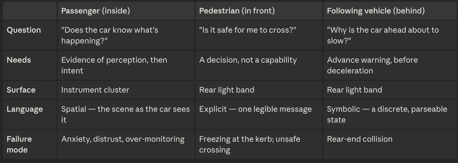
Message to the Passenger inside and the EV/vehicle behind
Message to the pedestrian
The interaction: four stages of intent
1 · Cruising — "I am driving myself." Steady cyan, the emerging convention for an automated-driving marker. Establishing this baseline matters: a signal only reads as a change if there was a resting state to change from. Inside, the cluster stays quiet.
2 · Detected — "I've seen you." At 28 meters the band turns amber and blinks slowly while the car is still at full speed. This is the pivotal timing decision in the project. Waiting until the car slows would make the signal redundant — the deceleration would already have said it. Announcing intent before the physics confirms it is what buys the pedestrian their decision time and gives the follower its warning. Simultaneously the cluster surfaces the pedestrian it has picked up.
3 · Yielding — braking to a stop. The amber continues through deceleration. The car comes to rest with a deliberate gap ahead of the pedestrian rather than nosing up to them—stopping distance is itself communication. Inside, the closing distance and falling speed are visible.
4 · Crossing—"You may go." Only once the vehicle is fully stopped does the band show a blinking PEDESTRIAN CROSSING. The invitation is gated on the car being stationary, not on it merely intending to stop, so it can never appear while the vehicle is still moving. The car waits and resumes, and the band returns to cyan.
Design decisions — including the ones I reverted
A pictogram lost to text. The first crossing signal was an animated walking figure, a six-frame walk cycle as a sprite sheet. It failed for a reason that only appears once built: the band is roughly 13:1, and a human figure drawn at correct proportions on a bar of that shape is tiny. Stretching it to fill the bar looked broken. Text is natively wide, so it fits the physical form the signal actually has. The pictogram was the more "designed" answer; the text was the legible one.
An animated symbol lost to a static one. Once legible enough to judge, the walk animation added nothing; the message is a state, not a motion. A blink communicates liveness far more cheaply and is read at a glance, and as a rear-facing signal it survives distance and motion far better.
A shape-changing bar, rejected. I prototyped the band expanding vertically during the crossing to make room for the symbol. It solved legibility and looked impressive but broke the metaphor: the band reads as a physical light fixture, and fixtures don't change shape. It made the car feel like a screen instead of a vehicle. Cut.
Blink rhythm as a semantic layer. Yielding blinks slower than crossing. Both are shifts in the same fixture, so rhythm carries the distinction, legible peripherally by a human and classifiable by a machine.
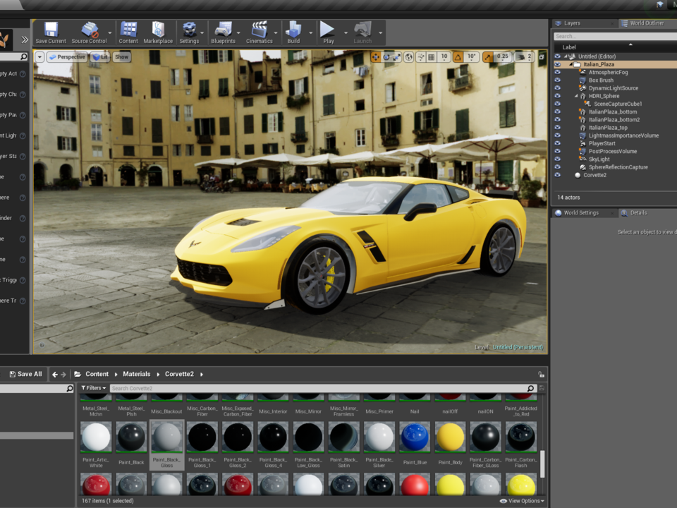
This is a design prototype: the interaction model, the visual language, and a real-time simulation demonstrating them. It has not been user-tested. The external conventions it leans on, like cyan for automated mode in particular, are emerging industry practices rather than settled standards.
Concept, design and prototype: Shiva Mohseni. Base: Unity Automotive HMI Template. References: SAE J3016 (levels of automation); Lee & See (trust in automation); agent-transparency (SAT) model.